The University’s logo is composed of three elements: symbol, wordmark and color. The logo should be displayed as a prominent element. The logo may be used only for official University business and is prohibited from use to promote non-University activities or imply endorsement of a non-University activity or product.
Primary Logo
As the primary visual graphic for San Francisco State University, it must appear on all official University communication pieces and may not be modified in any way. This logo appearing alone is the preferred visual representation for the University. It is available in different electronic formats appropriate to your usage needs.
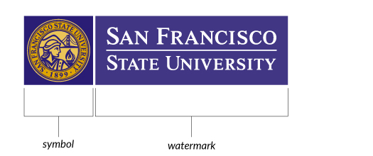
Secondary Logo
Because this logotype has a shortened version of the University name, SF State, its use is restricted to collateral targeted exclusively to on-campus/University community marketing, such as alumni materials, school spirit activities and student-related events. It should not be used on official communications such as letters of admission, contracts or grant proposals.
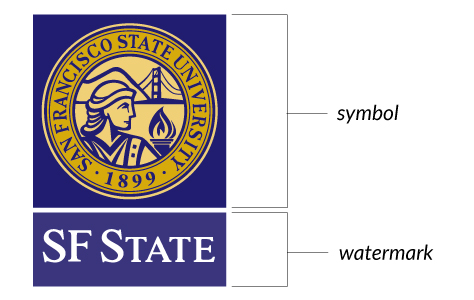
The Symbol
Elements within the symbol include the date of the University’s founding — 1899 — to emphasize the University’s rich heritage; stylized renditions of both the Golden Gate Bridge and Marin Headlands, to emphasize the University’s location in San Francisco and on the Pacific Rim; and illustrations of a flame and a classical goddess of wisdom, to represent commitment to enlightenment and learning.
The Wordmark
The University’s name is in a fixed relationship with the symbol and should not be altered, modified or repositioned in any way. The symbol should not appear separately from the words San Francisco State University or SF State, but work as one unit to create the logo.
Size and Clear Space
The University logo should be produced at a reasonable size to maintain legibility. It should be visually clear to the audience that the material presented to them is from San Francisco State University.
Minimum Size Requirements
The primary logo should be at least 60 pixels or 1/2” high. The secondary logo should be at least 120 pixels or 1” high.
Clear Space Requirements
To ensure visual integrity, there must always be a minimum amount of white or clear space surrounding the logo. The light pink areas shown in the diagrams are the amount of space that must be included between the logo and with any other graphic element, text or edge of the page.
Primary Logo: The correct minimum amount of clear space shall be the height of the letters San Francisco State University.
Secondary Logo: The correct minimum amount of clear space shall be the height of the box containing the text, SF State.
Downloads
This kit contains all of the logos you need for day-to-day document creation.