It is important for brands success that all of the SF State marks are used correctly including the positioning and size of all elements. The following are few examples of misused and unacceptable modifications of the marks, it is not exhaustive. If you have any questions regarding what can be done within the parameters of the visual identity system, please contact Strategic Marketing and Communications.
Logomark and Sub-Brand Don’ts
Do not change the colors

Do not add a drop shadow or other effects

Do not crop

Do not tilt

Do not stretch or distort

Do not place on a background of similar color/hue adding an outline for contrast

Do not separate and the graphic or wordmark as use as a freestanding graphic

Do not add or other text or graphic elements to the logo

Gator Spirit Mark Don’ts
Do not change the colors
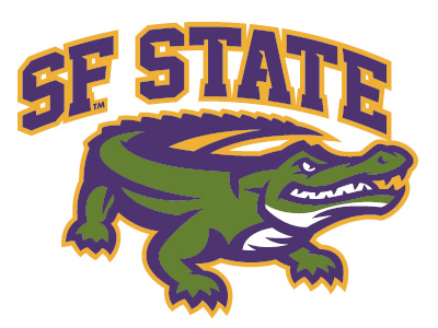
Do not tilt

Do not stretch or distort

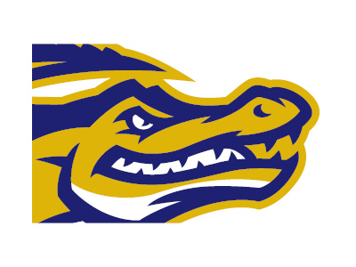
Do not crop
Do not superimpose with any graphic or text
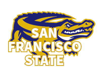
Do not use additional text or attempt to create a logomark
Do not add a drop shadow or other effects

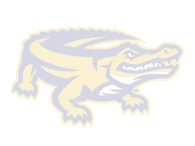
Do not use as a watermark or under 100% opacity
