San Francisco State University has embarked on a three-year web content redesign project with OHO Interactive. This webpage serves to communicate with the University-wide campus on the phases of this project.

General Questions about the Website Redesign Project
Strategic Marketing and Communications and Enrollment Management are heading the website content redesign process. After considering several companies, the University decided to hire OHO Interactive, a fully-distributed digital agency specializing in higher education. They have 65+ team members in 20+ states nationwide and offer full in-house strategy, design, development and project management. OHO specializes in working with universities.
There will be an entire website redesign which will include content, design and functionality improvements in order to better serve potential and current students.
The sfsu.edu website is SF State’s most visible public brand asset and should center the prospective student user journey first and foremost: providing necessary information, illustrating the student experience, and making the process from exploration to application and enrollment seamless. It should make audience pathways for secondary and tertiary users clear, disentangling internally and externally focused content.
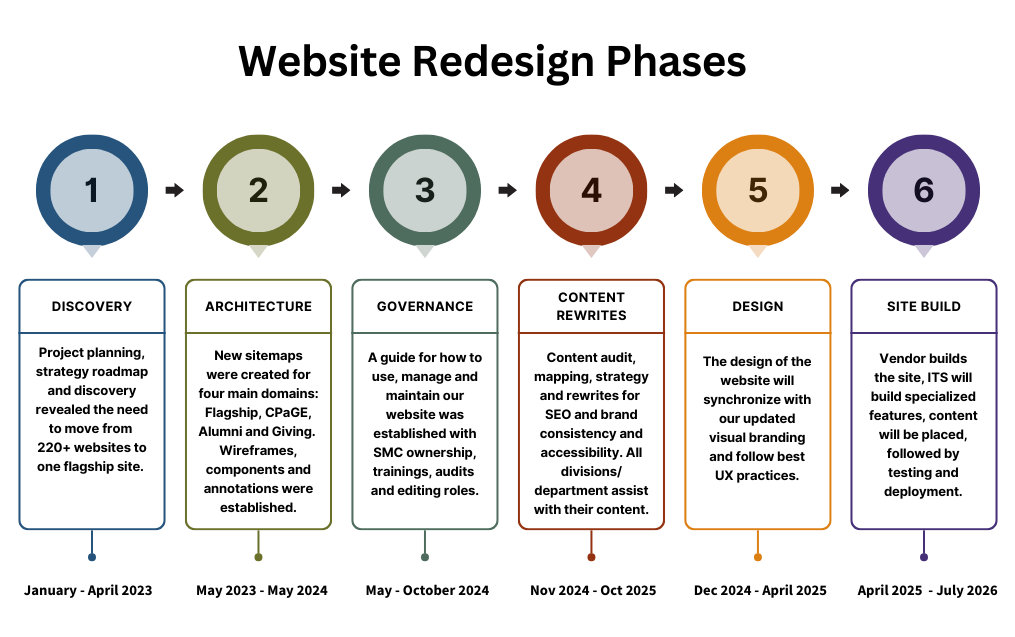
The website redesign project is scoped to take place over three years. We are currently in the third year of the project and expect to launch the new website in the summer of 2026.
Noteworthy Information
We will be moving from 220 websites to one flagship website that will house most of the content. There will be stand-alone websites for College of Professional and Global Education (CPaGE), Alumni and Development/Giving because these audiences are different than the flagship website. Athletics and Library will remain their own sites as well.
This centralized approach, to truly address our audience needs, will organize content in ways that reflect what information they are seeking and their goals, not our internal structure. Centralizing structure and content reduces duplication, reduces contradictions, pools disparate resources, and lessens the overarching burden of web maintenance in favor of strategy and clarity. It enables content sharing and collaboration in service of the web’s primary audiences, presenting a cohesive, brand-aligned whole.
We will be using templates to create listing and detail pages for content types which allows content to be pulled in and shared to relevant places throughout the site. Suggested shared content for this purpose include:
- Programs
- News
- Events
- Faculty/Staff Profiles
- Offices/Departments/Centers
OHO’s web governance plan, aligned to the new site structure, will address chronic website problems and ensure a sustainable web landscape. The site structure and build will align with CMS-based and offline workflows, roles and permissions that enable ongoing content quality assurance. Priority areas for consideration include:
- Usability — website must be easy to navigate, with intuitive functionality and clear user pathways
- Sustainability — the content expectations of the site must be realistic and aligned to defined goals
- Findability — content must be easy for both people and search engines to discover and comprehend
- Readability — website content must be easily consumed by a diverse audience inclined to scan
- Measurable effectiveness — content outcomes should be defined, assessed, and consulted to inform future efforts
Phases of the Website Redesign Project
OHO has broken the project down into several phases. Each phase consists of discovery, presentation and feedback. OHO will continue to guide each step of the way and will build the new website and work with ITS to implement.
- Roles & Responsibilities
- Project Goals & Defining Success
- Scope Review
- Budget & Approvals
- Risks
- Next Steps & Timeline
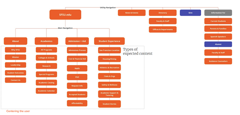
This is the proposed structure which is more organized, moving content for specific audiences to their respective sites (flagship, alumni and giving sites).
The Strategy Roadmap occurs during this phase. What is a strategy roadmap? The strategy roadmap is the guiding vision and plan for the project. It summarizes and synthesizes the information gathered from our discovery activities, offers analysis and context, and illustrates how we should shape this project to reach our goals and objectives. This is informed by:
- Goals and priorities identified in the kickoff meeting
- Needs uncovered in our stakeholder interviews (and user research, if applicable)
- Gaps and opportunities identified during our audits
- General best practices for our industry
OHO held several discovery sessions with different groups. What is a discovery session? OHO asking detailed questions to key groups to get a better idea of how our sites currently work, how they function and what aspects are missing. Another word for discovery would be research.
- Who participated in these discovery sessions?
- Web Steering Committee
- Current undergraduate students
- Current graduate students
- Marketing & Communications
- IT/Academic Technology
- Admissions & Financial Aid
- Student Life/Student Services
- Career/Leadership Development
- Alumni & Development
- Senior University Leadership
- HSI/MSI Stakeholders
- Faculty
- Deans
- What did the discovery sessions uncover?
- The primary audience and function of SF State’s website is to meet the needs of prospective students. Orienting the site around these users (and secondarily, their influencers, such as parents and counselors) is critical in meeting SF State’s enrollment goals
- The site also serves to direct a secondary audience of current students to key information for their needs
- Audience and utility navigation also directs tertiary audiences such as faculty & staff, alumni and others to relevant content, including content housed on an Intranet
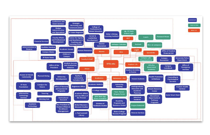
This is our current structure for our websites.
What is a sitemap? The sitemap is a diagram that represents how a website’s pages are organized (main navigation and submenus). It communicates where information lives as a function of prioritizing user and business goals. The sitemap will define which templates/wireframes will make up the new site. The sitemap should also be intuitive to outside users. This often means refocusing the site away from being organized by an organization’s institutional structure and internally-focused nomenclature.
The OHO user experience (UX) designer on our project combined sources of information to create the sitemap to include:
- Project Goals: project goals came from the Strategy Roadmap as well as specific goals our team set out at the beginning of the project
- User Needs: user needs came from research previously conducted, discovery activities OHO engaged in, and OHO's deep knowledge of user needs. Research included user surveys, interviews and focus groups. Discovery activities included content/UX/competitor audits and stakeholder interviews
- Information Architecture Best Practices: OHO adjusted the site structure for a more intuitive experience for our users. This included changes in page titles, reduction and reorganization of pages, and differences in the ways pages are grouped in order to account for user mental models
- Client Resourcing: OHO wants to build a site that we are able to manage with the staff and resources available to us. For example, OHO won’t recommend pages that require a lot of new content if that is not something we are able to create
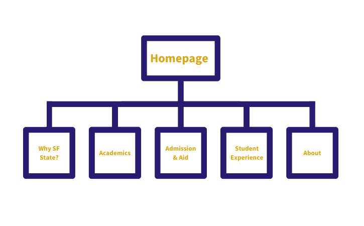
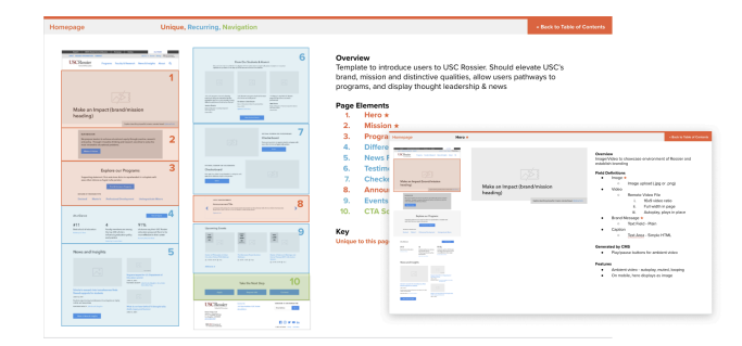
What is a wireframe? Think of a wireframe as the “blueprints” of the website, which serve to convey the page structure, content placement, functionality and navigation for the scoped templates. They intentionally exclude imagery, brand fonts and colors so that the architectural building blocks can be addressed first. They are the skeleton of a page or the building blocks of different types of components used to organize the content on a page. We currently use pattern labs on our websites, which is a list of components that we use to choose how to build our webpages. The wireframe shows what our new components will be to best organize and display our content.
The OHO UX designer on our project combined sources of information to create these wireframes to include:
- Project Goals: project goals came from the Strategy Roadmap as well as specific goals our team set out at the beginning of the project
- User Needs: user needs came from research previously conducted. This research included content audits, stakeholder interviews, and OHO’s deep knowledge of user needs from past projects
- User Experience Best Practices: OHO’s collective experience designing complex sites informs their approach to creating innovative and intuitive wireframes. The components, templates and navigational patterns they design are rooted in industry best-practices and customized to fit our unique project goals
- Client Resourcing: OHO wants to build a site that we are able to manage with the staff and resources available to us. For example, if a client has indicated that they have limited photography and no plans to do photo shoots, OHO wouldn’t present wireframes that heavily emphasized quality brand photography
The wireframes will drive the entirety of the rest of the project, including:
- Visual Design: wireframes indicate the hierarchy of content as well as the type of content that must be designed
- Back End Development & Content Entry: wireframes indicate specific ways content will be built and managed for back-end development and content entry

Annotation Documentation: Annotations are the website’s “user manual”: the documentation for how a website will be built and how it will function. The annotations take all of the wireframe’s templates, components and navigation and explain how the content will be entered, managed and shared throughout the CMS.
During the UX process, the developer has provided oversight for the sitemap and wireframes. During Annotations the UX designer, developer and QA analyst on the project work together to record the expected build and functionality from the point of view of a website editor.
What do the annotations impact?
- Back End Development & Content Entry
- The annotations indicate and finalize the specific ways content will be built and managed
- Visual Design
- The annotations indicate the functionality, components and page templates that will be designed. However, during visual design, functionality may change slightly; for example, a small layout change or the addition/removal of a button. If this happens, the annotations will be kept updated by a member of the OHO project team.
Web Governance Plan: San Francisco State University is implementing a formal Web Governance Plan to ensure SFSU.edu remains mission-driven, accessible and aligned with the University’s strategic priorities.
As the University’s primary tool for marketing, recruitment, retention and public information, SFSU.edu is a mission-critical asset. With significant institutional investment in our digital presence, clear governance ensures that our website reflects the quality, credibility and excellence of the University itself.
Why Governance Matters
Over time, SFSU’s website structure evolved in a decentralized way. While this allowed flexibility, it also led to:
- Fragmented ownership
- Duplicated or inconsistent content
- Accessibility risks
- Brand inconsistencies
- Reduced user trust
The new governance plan shifts the University from decentralization to coordinated participation, maintaining collaboration while strengthening consistency and accountability.
What Web Governance Is, and Is Not
Web governance is not a one-time website project.
It is an ongoing system that includes:
- Clear policies
- Defined roles and responsibilities
- Structured workflows
- Standards for publishing and quality assurance
This system supports consistent decision-making and ensures the long-term sustainability of SFSU.edu.
The Governance Model
The plan establishes centralized leadership with coordinated campus participation.
- Strategic Marketing and Communications (SMC) serves as the strategic lead and primary owner of SFSU.edu.
- The Technology Governance Board, consisting of University stakeholders across all academic and administrative areas, provides executive oversight.
- ITS partners in platform management and technical infrastructure.
This structure ensures the University’s digital presence supports institutional goals while maintaining clarity and accountability.
Clear Roles and Responsibilities
The plan defines who does what across the University website:
- Technology Governance Board — Executive oversight
- Strategic Marketing and Communication’s Lead Web Strategist — Standards, publishing and quality assurance
- Subject Matter Expert (SME) — Writing and final sign off on content.
- Web Content Editor — Drafting and maintaining content
- Web Content Approver — Accountability for accuracy
Every page on SFSU.edu must have a designated owner. Authoritative institutional messaging will be managed centrally to prevent duplication and confusion.
Every editor will need to attend Web Content Community meetings at least two times a year and participate in editor training.
Accountability and Quality Assurance
To protect accessibility, quality and brand integrity, the governance plan includes:
- Standard audits and maintenance reviews
- Accessibility and content quality assessments
- CMS access tied to required training and active participation
- Support-first compliance processes, with escalation if needed
The goal is to reduce rework, minimize risk and strengthen trust in SFSU’s digital presence.
Ongoing Review and Continuous Improvement
Web governance is an evolving process. Strategic Marketing and Communications, ITS and the Tech Governance Board will conduct annual reviews and continuous improvements to ensure the framework remains responsive to institutional needs.
Maintaining SFSU.edu is a shared institutional responsibility. This governance plan ensures our website reflects the excellence, clarity and integrity of San Francisco State University.
Frequently Asked Questions
Is this taking control away from units?
No. The plan clarifies roles and decision-making authority to reduce confusion and duplication.
Will this slow us down?
No. Clear standards and workflows reduce rework and streamline publishing over time.
Why centralize authority within SMC?
To ensure consistency, accessibility and brand integrity across the University’s primary public-facing platform.
What happens if a unit does not comply?
The approach prioritizes support and partnership first. Escalation processes are in place only if necessary.
How will success be measured?
Through data, regular review, accessibility compliance and ongoing accountability.
Design concepts show distinct ways our brand will be visually communicated on the new site. The design direction will accentuate and/or build on specific elements of SFSU's brand. The design will drive the entirety of the rest of the project as the structure of the website is built out.
Design concepts provide the foundation for the style guide (a document that defines font styles, color values, spacing rules and key interactive states), which the Drupal content editors will use when updating content on the new website.
The home page design is almost complete. The remainder of the wireframes are currently being designed.
The content strategy for the San Francisco State University website redesign guides the creation of copy and visual content that clearly represents our brand, supports our strategic goals and delivers a cohesive, user-centered experience. This strategy builds on insights from discovery activities, offering a framework to activate brand messaging, define voice and tone, and ensure consistency across the site.
Strategic Focus Areas
- Brand Activation: Ensure our brand messaging architecture is reflected throughout the website.
- Voice and Tone: Maintain consistency and appropriateness across all site content.
- Storytelling: Approach news and feature stories with a strategy that reflects SFSU’s mission and personality.
Key Findings from Content Audit
A comprehensive review of the existing website identified several areas for improvement:
- Inconsistent quality of content across domains and subdomains.
- Lack of standardization in visual and written content.
- Disjointed site architecture and navigation.
- Absence of navigational aids like breadcrumbs, leading to user confusion.
- Non-compliance with ADA guidelines in several areas, presenting potential liability issues.
Content Strategy Recommendations
- Showcase the unique character and values of the SFSU community.
- Align academic programs with alumni outcomes to guide prospective students.
- Highlight the University’s commitment to access, affordability and student support.
- Prioritize user needs in every aspect of site design and content creation.
- Establish digital governance to maintain content quality and site health over time.
Content Development Process
Strategic Marketing and Communications is leading the content creation process for top-level pages and will collaborate closely with subject matter experts (SMEs) across campus. A content matrix developed in fall 2024 helps guide this process by identifying:
- Subject matter experts (SMEs) and web editors
- SEO keywords and metadata
- Accessibility needs and attachment remediation
- Content mapping from the current to the new sitemap
Project Timeline
- Flagship Sitemap Content (this replaces the content on the current sfsu.edu website): Completed May 30, 2025
- Departments, Programs and Organizations Content: Completed October 31, 2025
*please ensure you follow the deadlines that your SMC representative has given you - Content Upload by SMC: Winter 2025 – Spring 2026
- Profiles, News and Events Content Creation: Spring 2026
- Full Website Launch: Summer 2026
- Training for Web Content Editors: Summer/Fall 2026
Content Writing Assignments
Each content writer within SMC was assigned a set of departments to work with.
All departments were contacted to schedule content development periods, which range from three to eight weeks. During this time, SMC representatives assisted with:
- Identifying your new sitemap and content for child pages/submenu pages
- Rewriting and reviewing content using designated content templates
- Advising on how to remediate, archive or remove attachments
- Providing resources on writing, accessibility, imagery and more
- Helping you stay on track to meet goals and deadlines
Content Templates
All content was written into standardized templates:
- Organizational Content Template: Replaces a department’s current homepage
- General Page Content Template or Plain Word Doc: For subpages/child pages
- Profiles, News, Events Templates: Created in later stages due to evolving content
Your SMC representative helped to guide you through using these templates during your kickoff meeting in the first week of your content development period.
Resources and Support
During your kickoff meeting, you received a comprehensive folder including:
- Web style cheat sheet
- Brand messaging map
- Best practices for writing web content
- Content templates
For video and imagery, please refer to our photo and video guidelines for submitting this additional content for the new website, which is due November 21.
Ongoing Support
To support you throughout this process, SMC offered twice a week virtual drop-in hours for web content and strategy guidance.
OHO Interactive, our website redesign vendor, has finished building the site on Drupal 11. The site has undergone a series of tests before being handed over to SFSU's Department of Information Technology (ITS). ITS is now working to implement additional features required for University functions. During this phase, all final written content, remediated PDFs and new imagery is being uploaded to the new site, followed by further testing. The full website is expected to launch in the summer of 2026.
As SMC uploads content, your SMC representative will reach out to the SME (subject matter expert) to do a final review on content to ensure it is accurate before the official site launch.
This page will continue to be updated as we progress with this project. Last updated on March 13, 2026.